Wednesday, May 31, 2006

Expanding My Focus


Happy Hurricane Season

Tuesday, May 30, 2006

Ledelle Moe, Congregation: G-Fine Art

Normally I wouldn't think of a small head as something to be marveled at. Upwards of 500 in congregation with one another tends to have a more lasting effect. Especially when each is hand-carved in cement. Yet, individually, each head resonates something of the artifact, something precious yet sturdy.

So rarely does my jaw drop when walking into a space. [Sometimes it is due to an oversaturation of information, or utter banality of something argued as significant.] These heads were remarkable - turned, talking, reacting, engaged, the voices in a choir. It is this animation, this relationship they have with one another that gives them their strength and removes them from the sterile presentation akin to tribal masks on a wall.

Individually it is clear that the whole is different than the sum of its parts. Annie Gawlak was kind enough to remove one from the wall for me, to allow me to touch it and feel its weight. And, as I stood there contemplating this little creature, I thought how barren this would be isolated and alone on my wall, without friends to accompany it. Though monumental and terrific on its own, it becomes a VCR on pause, trapped in time and waiting to be activated once again. I returned the little head to Annie so that it could once again gain life through communion.

Monday, May 22, 2006

Nakadate: Adamson Gallery

As I heard the words of Van Morrison’s Tupelo Honey in the background one phrase stood out as I made my way through Adamson Gallery exploring Laurel Nakadate’s recent work Trouble Ahead, Trouble Behind – “she’s got a wonderful sense of humor.”

That is also the limit of the work, on exhibition through June 3rd. The most interesting portion of this body (no pun intended) of work is contained in the first sentences of the press release and artist statement, wherein the artist embarked on a thirty day cross country train ride. The rest of the work can be summed up in well composed and designed photographs that attempt to be a little transgressive and yet remain impersonal, sterile, and narcissistic.

Placed in hotel rooms and the cabin of her train, Nakadate poses in her panties in the pseudo seductive poses found in Playboy. The sense of seduction becomes lost in the environment of polyester fabrics and overcast skies. When her gaze addresses the camera it never seems inviting or overly confrontational, but kind of bored. Color is muted and subdued leaving a mostly uninteresting photograph of a mostly naked woman in a mostly non-descript room.

And with this being the dominant theme of the show, there is work that rests out of place. The artist mostly naked on the back of a horse and the artist mostly naked somewhere in the desert come to mind. The color is rich, but the themes are out of place. Then there are the wonderfully graceful close-ups of the artist’s panties as they dangle from the window of her train (described in both artist statement and press-release). These are by far the strongest works on exhibit. They are elegant against the backdrop of a dreary sky. But the consistency of the overcast skies makes the narrative feel forced. Then there is the police car in the background of one photo, the looming threat of order and control, the push for transgression, and the inconsistency of thesis.

Qualms can be raised about the video as well. Her dance on the porch of the home from American Gothic is witty – a strip tease dance without the strip-tease on the unrequited reflexive emblem of American innocence. Then the song changes along with the video: artist seated in the cabin of her train, eyes searching the horizon wildly for a passing pick-up truck so that she can flash her tits mischievously and giggle, only to scope the horizon again.

What is apparent is the utter senselessness this work has. There is no goal within the work, no sense of discovery, no sense of the country, no sense of self and - dare I say - no sense of art. Any argument about sexuality or the female gaze become pointless in the face of this work – it isn’t there! It doesn’t even try to be shocking for the sake of being shocking (except maybe the sticker price of the work). It is the documentation of a wasted cross-country trip and abandoned underwea

Monday, May 15, 2006

The Pedagogy of Art Appreciation

When the bottom line of art appreciation's pedagogy is finally addressed by No Child Left Behind the overwhelming consensus will be "hunh?" Apart from being critical of NCLB to prepare the youth of Usonia from reading or pronouncing polysyllabic words like appreciation or pedagogy, and being fully aware NCLB will never address art appreciation, is the startling realization that disseminating some contextual level not only of what to appreciate in the arts but how to appreciate the arts is certainly stymied.

I address this issue only because I was (gulp) in the mall yesterday shopping and paused for a moment to guffaw at the stand selling "portraits" of Hollywood mafiosos montaged into dinner settings and Hollywood Hills backdrops. To be specific, there was one "painting" of Al Pacino from Scarface with that really big machine gun/grenade launcher, grimacing.

I type "painting" because it was not even a painting but a print of a painting someone made from this Hollywood celluloid still.

Of the five people who will read this, I am going to assume one of you is looking at this from an academic post post-modernist bent and thinking "wow... what a concept." I urge you, for the sake of all humanity to STOP! Apart from the debate over retinal v. intellectual within the arts, let us consider that the M.O. of this vending booth appeals to neither.

What upsets me even more is that, at the age of sixteen, without the aide of parental supervision, I might have purchased one of these things for ten dollars thinking how neat it was: it's a print of a painting of a movie that I like to watch. And I then might waste some wallspace hanging it. I might have even tried to frame it in some plastic framing device purchased at Hobby Lobby for a dollar eighty.

This long-winded diatribe intends to assess the crap we may casually place on our walls for the sake and gratification of not having a bare-wall. Part of this stems from the fear that investing $2000 in a painting seems fool-hardy. Part of it also stems from the reality that the average consumer does not have $2000 in disposable income to invest in such a commodity. Part of it stems from the reality that a lot of the paintings and drawings out there are not investments. Yet, as consumers, we are more than happy to plaster a wall with Coca-Cola memorabilia from the late 1980's, or something purchased at the Disney Store because it is kinda cute while simultaneously soul-less and mass-produced. Yet, for $125 this consumer could have waltzed into any art class at an area or near-by university or college, picked a still-life or figure drawing out at random, and walked away with a far better thing to appreciate and be appreciated by family and friends. For an additional $50 or $150 it could be exquisitely framed to add to the lauds of envious visiting spectators.

What is intrinsically missing in our national system of values is a measuring stick by which to appreciate not only the art we see in the museums and galleries, but also the stuff we are willing to place on our walls, conventional kitsch or otherwise artistic.

I had a friend growing up who was my colleague in artistic interests. Devoutly into comic books, he was also keen toward developing a sensibility and appreciation of the finer arts. His parents redeveloped their basement into an amusement center for video complete with surround sound and dimming track lights - very chique in that Midwest, suburbian way. On the wall opposite the painting hung a very ornately framed print of the School of Athens knock-off "The School of Hollywood" - Raphael's bastardized Stanza painting with Batman, Brando and Chaplin. While one of his academic figure studies or still life studies would have been very out of place in that location, why did he or his parents elect to place that print in the location and not one of his Lichtenstein inspired paintings?

Such is the dilemma I think in many homes across the States. The only art visible is in a gallery, and it usually costs an arm and a foot to obtain. Art that doesn't enter into the market through the gallery tends to wind up under the beds, in the closets, and up in the attics of the aspiring, never to be seen again. Much of it is bad and destined for the dustbin upon the demise of the artist or the artist's aspirations. But lurking somewhere in those corners are true gems. All that needs to be nurtured is the faculty of perspective buyers to acquire the work and consume wall space with it. How to educate this public interest is another issue? How to place the work into the marketplace is yet another.

The galleries might not be the best location or arena to educate this consumer, though it is not a bad-place to start. While the first objection might be "I don't know what kind of art to buy," the greater objection might be overall cost of the work sold. This is not to state that galleries are evil, but they are businesses, and a business' first priority is to stay in business. This means selling enough of a product to cover overhead. When I enter a gallery and see the majority of the work is priced at several thousand dollars, the owner is banking on the sale of several pieces to cover the operating expenses for the next month or two. There interest, if they are wise, will be to culture me into purchasing something in my price-range and suitable to my taste. But, since there is more lint in my pocket than there is coin, and if I do not work for a company of sizable interest, I may also not be worth their investment of time when at best I will yield for them an average of a couple Benjamin's annually.

So, what's left? The mall? Portraits of Pacino blasting away? This is a sharp drop from the gallery. Is there a middle ground? Perhaps the frame shop, that routinely covers profit margins through the sales and assembly of frames and occasionally has some additional wall space to showcase local artists (and their frames) for a slight to substantially lower cost to the consumer. But these appear weary locations because the art is less the center of attention, the art is not like that in the gallery around the corner or across the way, and the art is no where near the quality of that in the museum!

But does it need to be? This is what should be educated. As a country consumed by capital, maybe one of the adventurous methods of a new standard in academic art appreciation is not only to educate the 100-level masses into knowing the "blue-chips" from Piero della Francesca to Pollock, but to also provide a foundation for art-buying. This is so that Joe Iowa does not dismiss purchasing art - because he cannot afford to pursue the painter most probable to enter the Pantheon of art history - but rather becomes a conscious and supportive consumer of the things that interest him from his arts education at a level he can afford. This will limit the astronomic association that art must be priceless or not affordable to be appreciated. When the only conscious level of any appreciation of art is limited to the record sale of a Picasso Boy with Pipe, or an article in Art News about what is hot, then it is obvious we will be unable to nurture and grow a stronger art market within the US.

Additionally, where are the art sales from area college and university art programs, or high schools for that matter? I recall as an art student at Iowa State University that the ceramics, jewelry and print departments might pool their resources together and hold sales of work. Never the figure drawers. Never the painters. While art should not be produced with the sole intention toward sales, it should not be ignored that there could exist opportunities to promote and sell the work of students educated within art departments. These could serve as opportunities for the students to make a little cash for paints or a beer, and the department as broker to earn a little income for the maintenance of facilities. Lastly, it might serve as an opportunity of outreach and education, a stepping stone for the ignorant and novice art consumer to begin asking questions about his or her interest in the arts and how best to appropriately begin supporting the arts.
Tuesday, May 09, 2006

Quiet for Two Weeks

In the swamp that was preparation for finals and the organization of the 2006 Visions Festival at American University, I have had little time to sit and contemplate my art and naval over this blog. Pity.

Regardless, some very interesting art events have occurred personally.

First: Call for Entries. I think for the rest of the year I am going to ignore submitting work for any more exhibitions where I have to drop $25. Since the end of last year I think I have been rejected from three. My time preparing those forms and hemming and hawing over slides is better spent on making work and the money saved is better spent on wine and cheese.

Second. Exhibitions. My colleague and friend Randall Packer has asked me to assist on the second incarnation of America's Grave at the Athens Institute for Contemporary Art (Athica). Much of the physical architecture supporting the grave (cardboard) was soiled and disposed of after the grave was dismantled in March of this year, so it'll be fun to reconstruct this skeleton in a different and more stable material. There is a more complicated aspect involved with developing this new incarnation, one that might involve a very impressive map. I have a feeling multiple light boxes and topographical structures are in my near future.

Third: DC Commission for the Arts and Humanities. Thanks for the grant! In November I will be installing a piece (still untitled) at the Glenview Mansion Art Gallery in Rockville, MD. To give it away visually, it is a bus stop. Also, to give away the overall, there will be works on paper resembling torn posters (more than an homage to the late Rotella), an audio component and a newspaper. The grant will cover the printing costs. I better get that paperwork completed today.

Wednesday, April 26, 2006

Post Graduate Blues: pt. 1

I have a feeling this may be one of those posts that might receive a continuation somewhere down the road. Hopefully it is not wishful thinking like BoyzIIMen's TheYuppieYupAlexVanderpoolEra or GnR's Chinese Democracy, but I digress.

This evening I invited several of my colleagues to one of the classes I teach at CCA+D to give an alternative perspective to drawing, or at least an alternative to my handling of drawing. As someone who is not yet one-year removed from graduate school, a colleague is a very plastic term, and can denote a wide range of individuals. In this instance, it referred to my graduate school chums.

All of whom are burned out from graduate school: the subtle nuances of presentation (off the wall or on the ground; should it be framed; paper clips or safety pins), the lunacy in the significance of a color or shape, being specific, the over-thinking of content, and the constant barrage of visiting artists asking the same questions the previous visiting artist asked last week.

After one year it all melts away. The hostility at least. Perhaps not the memory of the hostility, but the hostility definitely melts away... at least until I look at the student loan.

Graduate school is intended to be the most selfish time of an artist's development. It's a club you pay dues to so that you may correspond with other developing artists, contribute and challenge ideas, and invest copious amounts of time debating green, reproduction versus re-production, the legitimacy of projection, the grammar of art, pseudo science and process, the cannonic defense of your studio approach, the legitimacy of nothing, and rhetoric... lots and lots of rhetoric.

One year removed I can safely state that I have learned more in that time than the entire two years I spent hand over fist in graduate school. Granted, this has much to do with the experiences I've had in the past year, the relationships I made while in graduate school, and the relationships I have made through post graduate networking. Therefore, I am also capable enough to admit that had it not been for those two years this year would not have amounted to a hill of beans, partially because the information received would not have easily been absorbed or decoded.

The Post Graduate Blues... you'll get over them.

Tuesday, April 18, 2006

Art at the Katzen

I think there comes a time in the tenure of any artist where he or she thinks to his or her self: what am I doing? With all the great artistic advancements of the last century, the only downside is what to do. This is a perplexing issue for any artists who wants to routinely sample at the veritable intellectual and visual buffet that compose the fine arts.

Near the end of this inaugural year, if there is anything that Jack Rasmussen, director of the galleries in the Katzen Arts Center should be most proud of it is the ability to push a few buttons. Throughout the year the exhibitions at the Katzen have become increasingly provocative both in form and in content.

Opening Wednesday, April 19th is an intriguing collection of work entitled Visual Politics: The Art of Engagement. As the Katzen website states, "On tour from the San Jose Museum of Art, this AU Museum exhibition focuses on art from the West Coast to examine the interconnected history of art and politics since the Cold War. Free speech, Vietnam, black power, gay rights, Chicano liberation, the environmental movement, poverty, immigration, and nuclear war are among the issues explored."

While it certainly cannot be said of all the work on display in the exhibition, there are key moments when walking through that it will not be uncommon for either the artist or the pedestrian to exclaim "I really should be doing more of this in my work." This might resonate more specifically with some artists who would otherwise pooh-pooh the idea of incorporating politics into their art for something more (seemingly)innocuous as space. While certainly space deserves as much attention as some artists will give it, it cannot be denied that art also functions as a means of communication. Visual Politics communicates symphoically, bursting forth with momentous bravado and passing subtly in melodious rhythms.

It should seem only natural then to equate an extension of Visual Politics reflecting in the work of the MFA Thesis exhibition - though this relationship is purely coincidental. Overall, what appears to be occurring is American University's shift away from what was once a traditional painting program, pushing between landscapes and abstraction, into something more encompassing involving the intellect as much as the retinal. It is unfortunate that the thesis work will only be on display for a brief period of time, because it is every bit as interesting as the work shipped over from San Jose.

Sunday, April 09, 2006

A Return to Cezanne

The major motivation for twice returning to the Cezanne in Provençe, on exhibit at the National gallery in DC through May 7, 2006, has largely been due to the academic necessity to expose several groups of continuing education students to the experience of engaging the master’s work both in the development of a single painting and in the evolution of a plastic idea throughout a lifetime of painting.

David W. Galenson, in his recent book Old Masters and young Geniuses sets Cezanne up as the archetype for the experimental painter in the Modern era – one who works towards an undefined goal through undefined means illustrated best directly through a quote “I seek in painting.” The progression of an experimental artist is through an evolution of steps, not leaps, and is always in the pursuit of finding. Conversely, the conceptual artist pursues defined goals through defined solution sets. Picasso represents this archetype with his quote “I don’t seek, I find.” The conceptual tend to arrive upon a painting rather than search for it. We’ll come back to this.

Cezanne is easiest to discuss form a formal perspective by how he puts on the paint and how he is structuring his composition. He becomes the painter for many to look at because a retrospective of his oeuvre becomes a step-by-step approach on how to construct a painting or how one might construct a career of painting. Through the scope of time he shows us two major jumps on the bookends of one subtle shift in his methods.

In the beginning of his work, exhibited in the second gallery shows many studio paintings with sitters and still life – very few landscapes. C. 1860, these paintings demonstrate Cezanne’s interest searching between line and plane to represent form. Plane is approximated through large meaty daubs of paint that appear applied with a club, whereas line rests heavy and black around specific forms within the composition: outlines that break. His first shift away from this is simply through what looks like a greater attention to thinning the viscosity of his paints. Suddenly by the 1870s the paintings become a bit more atmospheric, lighter. While this might seem like a simplistic observation, it is evident how this freed up his mark making. He expertly drew compositions quickly onto the canvas, overlaid appropriate formulae of color, and retraced line where necessary. In this process he quickly began to understand how the stroke of the paint applied with the brush affected the optical interpretation of space: lines in opposition will create an illusion of depth. Where he chooses to create lines that run parallel with one another he develops space through methodic experiments in value and color. Shifts in tone are what allow the space on the canvas to recede. This is something he had to struggle to find in his painting. This is also where a thinned paint will help the solution since oxygen takes less time to penetrate and dry a thin membrane of oil paint rather than a chunky glob.

A second, subtler shift in his work happens with a return to the studio. Whether Cezanne bounces back and forth between the two is not evident through the thesis of work presented on the wall. But, several quotes on the wall suggest his dissatisfaction with the studio earlier in his carrier, forcing him into the landscape. Later in his career he seemed able to construct a studio to fit his needs rather than constructing work to fit what his studio space allowed. Some later work of still life and skulls appear to suggest what he learned in the landscape was applicable to the studio environment once he found a suitable means of production. No suggestion is provided within the thesis of the retrospective to suggest that he ever abjured his sentiments regarding the studio from earlier in his career. But having any comfort to work in the studio would set up his third shift in subject.

The bathers seem anomalous and tangential to his body of work. In later paintings around Sainte Victoire Cezanne seemed to be less interested in the optical needs of representation and more attentive to the intellectual suggestion of form that occurs with how he works color and stroke. Some of this seemed abandoned when it came to the bathers where he stumbles around anatomical issues like an adolescent boy groping his first breast. Yet, positioned next to a late still life of fruit in the studio, it becomes apparent that Cezanne, with his heavy line and clumsy planar approach is a certain influence of Picasso and also a great influence of Cubism (Gardener also makes this correlation). With careful observations of Cezanne’s female bathers we are also likely to find influences for Les Demoiselles d'Avignon. While this gives no less credence to Galenson’s findings, and there are sketchbooks filled with Picasso’s preparatory drawings of Les Demoiselles, Cezanne offers a very strong backbone for Picasso and becomes the fulcrum allowing Modernism to shift into Cubism.

Tuesday, April 04, 2006

Hi-gloss Does Not Mean Hi-content.

The April 2006 issue of Art News is currently tackling some serious issues from around forty years ago: the validity of artists who paint from photos; artists who work between abstraction and representation; artists who work in multiple styles and media. Riveting! Of course, no subjective opinion is given on behalf of the authors, no thesis is deeply investigated and no great thought is ever pursued. Rather, a half-hearted attempt to create content within the magazine is reflected.

Why there should be any sense of profundity, let alone an argument, about the validity of painting from a photograph is beyond the attention that should be dedicated to the cover of the magazine. But, then again, it only reflects the sense of style that art magazines seem to delve into with greater and greater frequency by offering us a “glimpse” into what’s “hot” and “trendy” in the art market. Such analysis is probably better suited for the bulls and bears in the triangle below Canal. Though, it should not be too surprising if we see Damien Hurst’s name appear on the NASDAQ before the end of the decade.

Is painting from a photograph cheating? Whether debating about the intellectual subject of the painting (the photo or the subject of the photo), there still exist issues of light, form, space, stroke, color, mixing, and on and on and on. But moreover, it’s an antiquated belief that working with any optical device destroys the divinity of the image. After all, the sacred space created within a painting echoes back to the time before the Renaissance when a painting existed as the iconic representation of Jesus/God. Arguments against the use of photography as a tool for painting can trace a direct lineage to such similar sentimentality. The only difference is if you are caught using an optic tool to create a painting today the Catholic Church will not punish you with death.

What becomes disturbing in this trilogy of features is the proclivity in the final article, Boundary Issues, to present the toxic information of price into the equation. Rebecca Spence twice provides the reader with sales prices for painters who straddle the line between abstraction and representation. How does price even enter into the studio space when it comes to the creation of the piece? I’m happy for Kristin Baker to be able to sell out a show three years after graduating with an MFA from Yale. But, what does that have to do with the content or even the subject of her work?

Hi-gloss does not mean hi-content.

Thursday, March 30, 2006

Analysis:

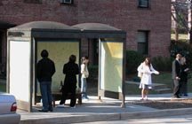
At around 5:45 this afternoon the Post-It notes came down. In retrospect, I believe they still should have come down before noon – the bus stop in Glover park only functions as an environment in the mornings when relatively large masses wait for every bus. In the evenings the converse occurs; it is where the masses come to descend.
Art is something that makes us recall our environment and see it from a different perspective. Art involves a transformative process, an awakening, moment of clarity, or moment of bewilderment, that re-contextualizes the known. It is why a representational painting is so easy to identify as “art.” We acknowledge the surface the image is painted on, we identify that it is an image providing the illusion of a deeper space, we identify that it is made by a hand, and then we abandon these concepts quickly to judge the quality or effectiveness of the representation. It is this last moment that becomes the sticking point in art appreciation: when judgment overrides discovery. Art is about discovery, and sometimes the acknowledgement of that discovery.
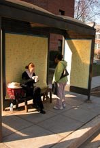
It was the moment of discovery that was most appealing to witness this morning. A man walking hurriedly to the bus stop this morning stopped in the middle of 41st street the moment he recognized something was different with the bus shelter. Granted, this is not necessarily the moment one recognizes art, only difference. It was the people who chose to enter the bus stop. Part of the function of the “wall paper” being hung only on the interior was so that people would have to enter the space to get the true sense of the content and the texture.

One man drove past in a pickup truck and did a u-turn. He parallel parked and got out of his truck to inspect the piece. Some people left notes. Most did not. Some chose to ignore the nature of the Post-Its, perhaps afraid of the discovery. One woman sat contentedly eating a cup of yogurt while waiting for the bus, perhaps not changing her daily routine to read what was around her.

Nothing overly prophetic was scrawled on the pieces of paper. Most were just the absent reminders of things to do in the passing of the days or weeks to come. The richness is that these thoughts are not as disposable as the pieces of paper we place them on – they are important enough to write down. These notes acknowledge the overwhelming busyness we succumb to. You could summarize it as Christo and Jeanne-Claude meets Post-Secret. But that only
describes what it looks like,
and not the true nature
of the beast.

Note 2 Self Documentation


Note 2 Self

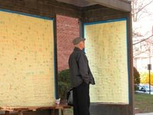
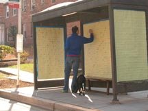
In a bus stop on Edmunds St and 41st, NW Washington, DC, I have finished installing an uncommissioned, temporary work of interactive public art. I am unaware if this is technically legal, but if people can tape signs advertising their garage sale or grocery store, then I should have the right to cover an entire bus stop in Post-It Notes.

The piece will exhibit from 1:00 this morning and run through about 11:00 AM EST.

The bus stop is an extension of our office space and our living room - the portal in between. Common in both locations are Post-It Notes, these convenient little yellow tabs (invented by my cousin Art Fry at 3M) remind us of the things we have yet to do and the things left undone. Consuming approximately 3000 Post-It Notes, they were adhered to craft paper so they could go up like wall paper and to possibly secure them through the duration of the installation to prevent liter. Attached solely to the inside of the bus stop intends to reinforce the idea of the internal environment of the work space and to also prevent further degradation from the elements. Pens were left behind so that commuters could contribute to the work during the duration of its installation.

Sunday, March 19, 2006

No Photo. No Flash.

This is a statement of museum etiquette: when the gallery space is dimly lit, and the sign says "no photography," that means you should not approach a piece of art behind plexi and proceed to photograph it with your 3.2 megapixel Nikon, as I saw some twit attempt at the Sackler this past weekend. This is what Google Images is for, or perhaps the books in the gift shop.

More importantly, what is this preciousness we grasp hold of when it comes to a work of art that has been deemed "great?" There are thousands of great works in the Louvre, for instance. Yet, when people visit, every idiot runs through miles of hallway, to go elbow-to-elbow with scores of others, standing on tipped-toe, to see the Mona Lisa behind a yard of bullet-proof glass - skiping over several centuries of great work in flight. Uccelo, Crivelli, and others get ignored for an ugly woman in a dim landscape further popularized on the cover of a piece of trash written by Dan Brown or doodled upon by Marcel Duchamp. Yawn! It is this object-orientedness that prevents so many people from really spending time with art, or how art functions, only so they can be good at Trivial Pursuit.

What does taking a snap-shot of a piece of art really mean? A document or record to remind her that she had seen the work? Is that necessary? Or does looking at that murky, dark image with a faint trace of the great work of art really remind her years later when flipping through her photo album? No. It doesn't. Will that photo be as great as the moment she spent recognizing and then ignoring the great work, only to gaze at it through her viewfinder before briskly moving on so as not to draw attention from the guard? No. It won't. Will it impress friends and relatives? No.

Preserve your integrity. Leave the cameras at home.

Thursday, March 16, 2006

Letter to Middletown School Board

in response to what was seen on Mr. Campello's page about a week ago, I penned this letter to the Middletown, NY school board. Their actions upset me to no end.


To Whom It May Concern:

I was quite disturbed recently to learn that a highly gifted and well-qualified educator of the arts, Peter Panse, was suspended by your administration for suggesting to his talented and zealous student – eager to pursue their education in the arts – that they should take a figure drawing class.

As an art student, beginning at the age of fifteen, I regularly attended life-drawing classes at the local art museum in Davenport, Iowa. Students under the age of eighteen were not allowed to attend the class without guardian consent. These classes were paramount in the foundation of my arts education, freeing up my drawing hand in terms of gesture, line quality, and observation. Additionally, the classes called attention to issues in proportion and scale, weight, balance, and human anatomy and physiology.

Without the opportunity to take these classes I might not have become as skilled or as interested in the arts as I am today. This is for several reasons. First, the pose of the model dictates an element of time. A pose can only be held for so long before a model might tire or collapse. With this in mind, a discipline of speed is instilled within the artist to capture the essence of the pose. The same sense of speed may not be learned as easily by drawing a still life (of vessels and shoes, for example), because a still life possesses only a static nature. Secondly, a variety of poses, and therefore drawings, can be accomplished quickly in a set period of several minutes or hours. The same might not be as true, using the example of the still life, because of the limitations involved with set-up of a still life or the availability of materials. Most importantly, what a figure drawing class offers is a mixed environment of student, emerging, and mid-career artists collaborating in an educational atmosphere, exchanging ideas and styles.

To believe that this is a sexual atmosphere is ignorant at best. The arena for figure drawing becomes a sterile laboratory, with the model as a subject. The discipline is the drawing of form, not the oogling of reproductive and excretory regions of the anatomy. To even think, for a moment, that figure drawing would even stray from such disciple is as shameful as reprimanding an instructor for simply recommending and encouraging that his students exercise their artistic skills by seeking out and participating within such a sterile and collaborative environment. And if it is the “exposed” anatomy that concerns you, to draw a parallel just as ludicrous, would you suspend your biology instructors, who cover sections on anatomy and reproduction, for using the words penis and vagina because they may be misconstrued as suggestive and indecent?

The action to suspend Mr. Panse is offensive to intellect and choice. It is offensive to an academic environment that holds, above all other things, the opportunity for students to excel. I urge you to reconsider this action.

Wednesday, March 15, 2006

The Fulcrum of Modernist Painting

While meandering through the retrospective Cezanne in Provançe, I overheard the following statement, “his earlier paintings looked more like something.” Such a comment is typical of pedestrian appreciation, which is not incorrect, just categorically arrogant, ignorant or misguided.

Art, by definition, should not be a work by the hand created to look like something “recognizable.” This idea was abandoned nearly two centuries ago with the invention of the photograph. Arguably, the idea occurred before that.

Cezanne represents many things in the history of art. Had it not been for his analytical dissection of form I ponder if Cubism would have occurred so soon thereafter. There is an immense consideration of how the paint is applied – simply look at the brushstrokes of his paintings in the 1880s for further evidence of this. And there is this obsession of something so inane as a mountain for a subject, painted again and again – a passion best understood by artists, and maybe Chicago Cubs fans. Barbara Rose has commented on several occasions how Cezanne is “the Greatest 20th Century artist of the 19th Century” (and Picasso the inverse). It is for the above reasons. It is for those reasons Don Kimes yelled in an Italian restaurant, in Todi, Italy, “I can’t get past this fucking Cezanne!” It is for those reasons Al Held, at a nearby table, picked up his glass of wine and walked over to this perfect stranger and said something equivalent of “you too?”

For the pedestrian, artists do not expect you to really “get” Cezanne. He is only the fulcrum of Modernist painting.

Sunday, March 12, 2006

The Relationship Show

It is with regret that this post comes so late, for by far the best show I have seen in recent months not sponsored by a museum has been this little opus by three “emerging” artists in DC: Breck Brunson, Nilay Lawson and Solomon Sanchez. The press release states the exhibition explored “the relationships between self, society and community,” all of which is evident without reading the release; there were several works that resonated at that level, and a few that perhaps needed the release to guide us through.

The first pieces welcoming the public to the space are visible or audible from the outside. Sanchez’s aptly titled White Submarine Emerging from Synthetic Hair placed the modeled top half of a submarine emerging from many locks of synthetic hair within the front window of the gallery. This work suggested the wit and cynicism that might be found on the inside of the gallery in the other works of art. It could relate to the emerging artist, the wallflower at the party, or that NSA agent listening in to your phone calls overseas; who knows what rests beneath the pool of hair. Overhead, Brunson’s sound installation And I know tomorrow will still be the same could be heard squeeling into the street. Contained within, the R&B song “Always and Forever” was no longer recognizable, and possessed an eerie, fighting quality – a stuttering elocution that became too slow and forced to be understood. Far more subtle than its street-level partner, pairing the title of the work with the title of the song emotes the wonderful suggestion that for how much we want to see things change and evolve, growth can often be a slow process in the art world or otherwise. The end of this song might not sound much different than its beginning, and certainly no one is going to stand around long enough to wait for the sound to change for very long.

Inside different works of art echoed what was publicly exhibited as well as what was exhibited on the inside. Sum Mate, a black plastic bag with a video looping on the inside of hands hurriedly counting bills, and A safe too full to be closed, consisting of a wood constructed and painted to look like a safe stuffed full with stacks of money, sat on opposite ends of the gallery space quoting for many of us what will be that unattainable dream: financial security. Alternatively, it also suggests the hustle to earn, to be rewarded. A large phallic structure, Lawson’s 14” Diamond Tip, certainly played an ironic twist on the issues of “love” as publicized by celebrity and teen magazines. Neither the size of the diamond on your finger, nor the size of his cock, truly signify the affection or trust found in a committed relationship - though both might make a lady feel good for a little while. It might also connote the hustle that some women have to marry rich. It’s shape distantly echoed the work of Sanchez’s submarine, or his Permanent marker bleeding through surface of paint, which also had a pink phallic/submarine nature to it.

Perhaps the weakest piece, structurally, was the painting Spite Night, which lingered somewhere between a formal painting and a cartoon without really embracing one or the other. Not that it had to. The subject, however, played wonderfully the themes associated with a party (or a large gallery opening) wherein people are drinking, socializing, ignoring the stuff on the walls, and possibly screwing in the bathroom. A little touch of Red Grooms in this painting, several narratives could be assumed questioning the relationships between the multiple characters within. Who was with whom, and who went home with someone else?

What is perhaps most important is whom this collection of work could speak to: easily everyone. Issues of money and sex are pervasive throughout our culture.

The Relationship Show exhibited at Transformer until March 5. The submarine might still be in the window, but “Always and Forever” is no longer playing.

Friday, February 24, 2006

Heike Baranowsky

The recent exhibition of Heike Baranowsky, at G Fine Art, is a grand exercise in banality. Her resume and the prices she is attempting to pan her videos off at are far more impressive than the work on exhibit. Five videos consume the space, with four photos tacked to the wall near next to the door. The videos consist of a landscape near Joshua tree where, if you stand around long enough, you might see a plane cross the sky; a tumbleweed dancing down the road in the desert - by far the most entertaining; a zepplin in slow motion; butterflies in even slower motion; and birds in the Illinois landscape. The flier on the work states that an unexpected dimension of geographical and political intrigue of hysteria and militarism is suggested by the four photos in the entry. Perhaps. It is a stretch and at best a lean away from art toward photo-editorialism.

Saturday, February 11, 2006

Borf Is Another Excuse.

I recently learned that a street vandal/artist named Borf, was recently given a sentence of one month in DC jail and a $12,000 fine for his acts of vandalism. Some in the community think the sentencing is too harsh and a sign of fascism. Others think it is not quite enough.

The Washington Post published an article on the youth within the past year shortly after he was apprehended. http://www.washingtonpost.com/wpdyn/content/article/2005/07/13/AR2005071302448.html

With a great bit of unbias, they depicted him as a kid who has a basic understanding of some conflicting political models and chooses to go with some mediocre form of anarchy: spray-painting the image of a friend who committed suicide a couple of years back. The last couple of years he has made his mark on the DC area with his stenciled spray-paintings and Basquiat-like sayings. While Borf thinks �Borf is good for your liver,� having seen a number of his ramblings and the copycat marks of wannabes, at best I can argue that Borf is a lazy excuse of a bored, rich brat that thinks he can solve global problems with a can of spray-paint and random tags.

Were his stencils interesting? Yes. Was he a good kick in the ass for DC? Perhaps. Not so much for his politics but more for the brilliant and playful eye-sores he composed on buildings, street signs, and the like. The image, after all, was engaging and stimulating more so than his silly little phrases and slogans. Does he deserve to go to jail for damaging property? Yes.

A bigger issue ensues, however. There is a grey area within some street art. For example, the playful meter pops of Storker, who transformed several DC parking meters into lollipops with colored, transparent tape. Inventive! And bit of a nuisance if you were an individual trying to put some coin into your meter for a couple hours of parking. Did he have permission to do this? It�s hard to say; nothing indicates whether local authorities had given him permission to pursue this project. Certainly a bit more genius than the pseudo-Marxist ranting of a teenage brat who thinks everything is so unfair (like all other teenage brats). Would this guy deserve to go to jail for the inconvenience from clear-taping a parking meter? No. Perhaps a small fine since nothing would be damaged, just sticky.

What becomes the spur in this argument is if the Borf decision has the potential to produce a precedent, which all non-commissioned public artists should consider before engaging in their work. I appreciate the humor of plastering the word �bush� or �the war� below the �STOP� of a stop sign. But art and message has a limitation. This is an obstruction of a functional piece of information. And though the red octagon has worked it�s way into the semiological lexicon as a signal to stop in our culture/country, its obstruction in any form is problematic. The thought of spending a night in county for a cause is commendable. But it depends on the cause. I would not want that cause to be transforming a parking meter into a lollipop, even if executed on a Sunday when quarters are not necessary. Nor would I want to cozy up to some guy on a misdemeanor charge of public intox because I was lamenting the death of a friend by commemorating his life-taking-act by tagging a mailbox with a crude saying that has no relevance to the dead friend.

Tuesday, February 07, 2006

Eurekas

Today was a day of Eurekas in my teaching career. The first came during a color exercise in my undergraduate class at American University. I asked students to illustrate an emotion through color, something described in Patti Bellatoni’s book “If It’s Purple Someone’s Gonna Die.” I gave students opposing emotions: Love and hate, Sympathy and Indifference, Joy and Sorrow. Some of the students gave me specific illustrations to convey their emotion, but I was most interested in the colors.

Each student picked his or her color out of a hat and no student knew what the other student had. Then they got to illustrating. When a section was called to the front of the class – for instance joy – all of them had yellows in their illustration. Yellow was mixed with various colors, most of them “warm,” but all of them were tone. So if yellow was mixed with a blue, it was like a sky blue rather than a navy blue. If it was with a yellow it was a sunny yellow rather than an ochre. Love was illustrated with light reds and pinks. Hate was illustrated with dark reds and blacks.

I tend not to illustrate a color with a mood or emotion because colors or so varied in association. A green grass is different that a toxic green for instance, and the natural has a more pleasant association than the synthetic. But, noticing how universal these students were with their assignment of color to emotion makes me wish to rethink some of my thinking. I believed color had an influence, but I never realized it was that strong!


The second eureka occurred in my continuing education class in McLean for the Corcoran. This class is filled with people who want to learn how to leisurely paint. The problem is some of them don’t know how to draw. Drawing is not fundamental for painting, but it sure does help!

The major hurdle between painting and drawing is if a person is drawing with a pencil, he doesn’t think about a color. Drawing = Pencil. Drawing becomes a problem for some when drawing = shading, but at its core drawing = pencil. Give a student charcoal and drawing = mess. Now give a student paint. Paint = Color. Line, shape, form, positive/negative, measurement, and proportion – it all goes out the window. How do I get that color? This is what I was asked several times tonight.

We drew with paint this evening to break them out of thinking Paint = Color. The first drawing they all drew the contours of positive shapes. Each student might draw a vase and get caught up on all the intricate details of the vase. The student would draw in the vase behind that vase, but accidentally draw it smaller than what they were observing, or place it in the foreground. Common mistakes.

The second drawing they were told to draw the negative shapes only. This becomes tricky. Eventually the negative shape between objects will inadvertently identify a positive shape. If a candlestick is behind a flowerpot (sans flowers), part of the negative space of that candlestick will be the flowerpot. There is no avoiding it. Black becomes white. White becomes black. Some students couldn’t tolerate going through the looking glass like that. Question: If the flowerpot it positive how can I draw that line? Answer: Because that line defines the negative space of the candlestick and the positive space of the flowerpot. (It also defines vice versa).

The last drawing they could only focus on large forms of shadows and highlights to identify their composition. This process created new problems because they were trying to draw the shadows as linear marks with big brushes. They were also encouraged to build up shadows, moving from light to dark. Smaller and smaller strokes became necessary, as did smaller and smaller brushes. Some were so exasperated with this process. But, despite their increasing exasperation with each painting, the paintings improved with each new approach. They were learning how to see in new ways each time.

Saturday, February 04, 2006

Photographic Memory

I recall prior to finishing graduate school, in preparation for our thesis show, we had the option to photograph ourselves which the surprising majority of the group seemed ambivalent and the two decided people saying no swayed the voting. “The last thing we want to look like is a bunch of goddamned abstract expressionists,” voiced one of my colleagues.

Sadly, I admit, I wanted us to. Not that we were anywhere as near as collegial as they might have been. As a group we were fairly disengaged from one another’s work. There were pseudo intellectual discussions about what some writer meant in regard to discussions about class or taste – a misguided approach into something theoretical – which only intrigued a couple of the group. There were formal issues about space and form that interested a couple of others in the group. Never a consensus was reached, nor a heated argument. The only thing that was lamely agreed upon was that we would not look like a bunch of abstract expressionists with our black-and-white-suited-image on the cover of some postcard.

Some months later I was helping Barbara Rose move out of her DC apartment for her return to the Big Apple, and she was remiss about her time in DC, somewhat regretful and somewhat proud of the few things she may have accomplished. One of the accomplishments had in part to do with the success of a group of students whom she helped educate. She told them “get a show together at a gallery in town, put a catalogue together and I’ll write the intro.” They paid attention - so she wrote for them. One of the things that tickled her was the photo: “like the Irascibles,” as she put it.

For some reason I felt a little more certain about our decision not to do that photo. Granted, when I think of black and white photos of groups of artists gathered together in suits, I think of the guys at the Bauhaus, I think of the Dadaists. I think of guys (rarely is there a woman pictured with them unless it’s Duchamp in drag), in a time when wearing the suit was expected, gathered together with common interests. The suit is like a uniform, not of art, but of intellect.

Thumbing through the Guggenheim’s retrospective of James Rosenquist a while back I looked at the pictures of those Leo Castelli represented. All the heavyweights of the 1960s and 1970s are there: Rauschenberg, Johns, Warhol, Rusha, Lichtenstein, Kelly. No suit. No uniform. A haphazard collection of men (except when Ms. Rose might be amongst them). It is as likely to be a reuniting track team from the Waukesha High School class of ’58 photo as it is to be a collection of the most successful artists since the end of the Truman administration. And everyone is all smiles.

The ideas have not evolved greatly since the Bauhaus or Dada. Those artists were doing whacked out installations, collages, decollages, assemblages and paintings that for what was to follow forty and now ninety years later can just as easily be misconstrued as farcical repetition as it can be acknowledged as serious art. Part of it has to do with not being aware of our history. Part of it might have to do with the photos.

As for the graduate photo that never happened, I think I am rather glad. Our ideas never gelled in those two years together into something that could be confused as a movement or a manifesto. Largely I think the ideas are still swelling and relaxing, each going their separate way. I am in search of colleagues.